From KAN Theory to Practice - Link Prediction in a Real Network
In my previous blog post, I introduced the Kolmogorov-Arnold Network (KAN) - its structure, why it differs from MLPs, and why its interpretability is worth exploring. Now, let’s make that concrete by solving a real-world graph problem from scratch. Please find the code and data at the bottom of this page.
The Problem - Predicting Links in a Graph
Our dataset is the Facebook Food Pages Network.
- Nodes - Facebook pages related to food
- Edges - A “like” from one page to another
The challenge:
Given two pages, can we predict whether there is (or should be) a link between them?
This is the classic link prediction task in network science. It has broad applications - from recommending new friends in social networks, to predicting protein-protein interactions in biology.
Step 1 - Extracting Features
To solve a link prediction problem, we can’t just look at the node IDs - we need structural features that describe how two nodes relate in the network.
I chose six features, all rooted in established measures from graph theory:
-
Degree of u / Degree of v
- Number of connections each node has.
- High-degree nodes (hubs) are more likely to connect with others, but degree alone is rarely decisive.
-
Common Neighbors
- How many other nodes both u and v are connected to.
- Simple but effective - in social graphs, friends of friends are more likely to connect.
-
Jaccard Coefficient
- Fraction of shared neighbors relative to total neighbors.
- Normalizes common neighbors so large hubs don’t dominate.
-
Adamic-Adar Index
- Similar to common neighbors, but down-weights “popular” neighbors.
- Gives more weight to rare, specific shared neighbors - which often signal stronger similarity.
-
Preferential Attachment Score
- Product of degrees of u and v.
- Comes from network growth models where high-degree nodes attract more edges.
Together, these capture local similarity, node popularity, and neighbor specificity - three complementary drivers of link formation in many real networks.
Step 2 - Creating the Dataset
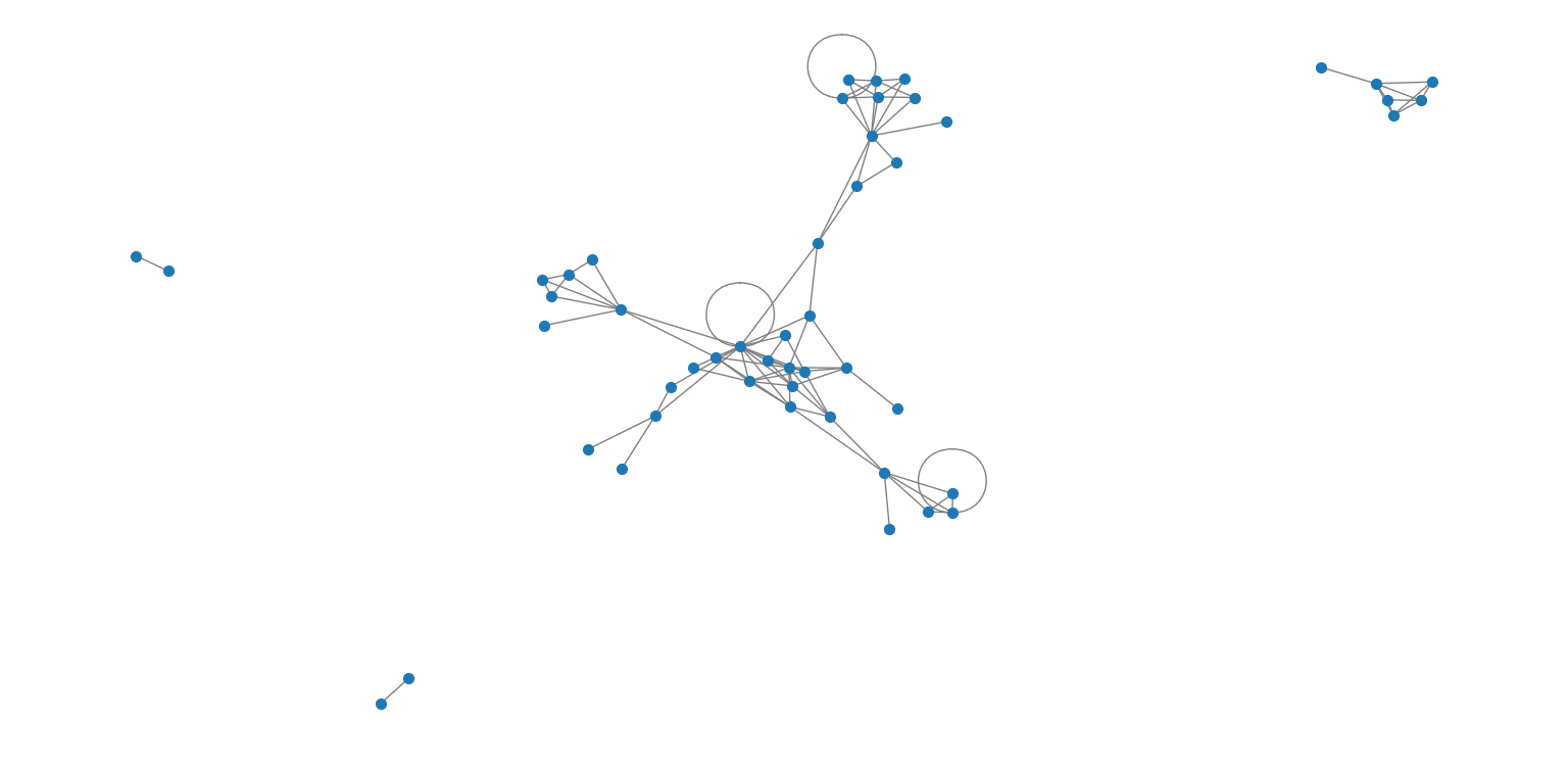
Before computing features, here’s a visual sample from the original Facebook Food Pages Network. Each blue dot represents a page, and edges represent “likes” between them.
- Load the graph from the
.edgesfile. - Generate positive samples - real edges from the graph.
- Generate negative samples - random pairs of unconnected nodes.
- Compute the six features for each pair using NetworkX.
- Label positives as 1 and negatives as 0.
This gave me a balanced dataset with a total of 4000 pairs of connected and unconnected pairs, ready for training.
Also, to evaluate how informative each feature is, we can visualize the pairwise relationships and distributions of common_neighbors, jaccard, and adamic_adar.
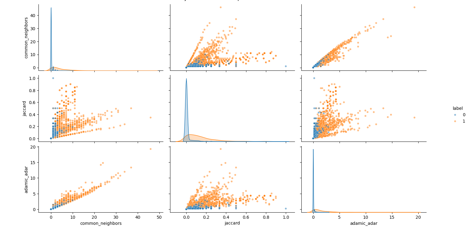
All three features have some predictive power - especially common_neighbors and adamic_adar (their orange/blue separation is noticeable). Subtle foreshadowing of the KAN results to come! However, there’s overlap - meaning we’ll still need a classifier to combine them effectively.
Step 3 - Why KAN, and What’s RBF?
A Kolmogorov-Arnold Network differs from an MLP in one key way:
- Instead of fixed activations (ReLU, tanh), KAN layers use learnable basis functions - often Radial Basis Functions (RBFs).
\[ \phi(x) = e^{-\frac{(x - c)^2}{2\sigma^2}} \]
- It’s localized - strongest near its center \(c\), weaker farther away.
- KAN stacks many such functions per feature, letting it model non-linear, non-monotonic relationships without hand-crafting them.
This means:
- If a feature is useful only in certain ranges (a “sweet spot”), KAN can pick that up naturally.
- This also makes KAN more interpretable - we can plot exactly how it transforms each feature.
Step 4 - Training the KAN
- Inputs - the 6 standardized features (mean 0, std 1)
- Loss - Binary Cross-Entropy
- Optimizer - Adam (lr=0.003)
- Epochs - 120, Batch Size - 128
And Why the Parameter Values Make Sense
From my code: Q_TERMS = 6, M_CENTERS = 8, INIT_GAMMA = 1.0.
I did not use any tuning beforehand. Instead I used the following logic:
- Q_TERMS = 6
Matches the number of input features. This gives each term the capacity to model distinct feature interactions, without redundancy. More terms could lead to overfitting; fewer could miss relationships entirely. - M_CENTERS = 8
Covers the standardized range (-3, 3) evenly, with a center every ~0.75 standard deviations. Enough resolution to capture meaningful bumps and dips without tracking noise. - INIT_GAMMA = 1.0
Starts with moderately broad RBFs so neighboring centers overlap, which ensures smooth gradients and stable early learning. Training can still adapt widths as needed.
Figure 1 - Training Curves
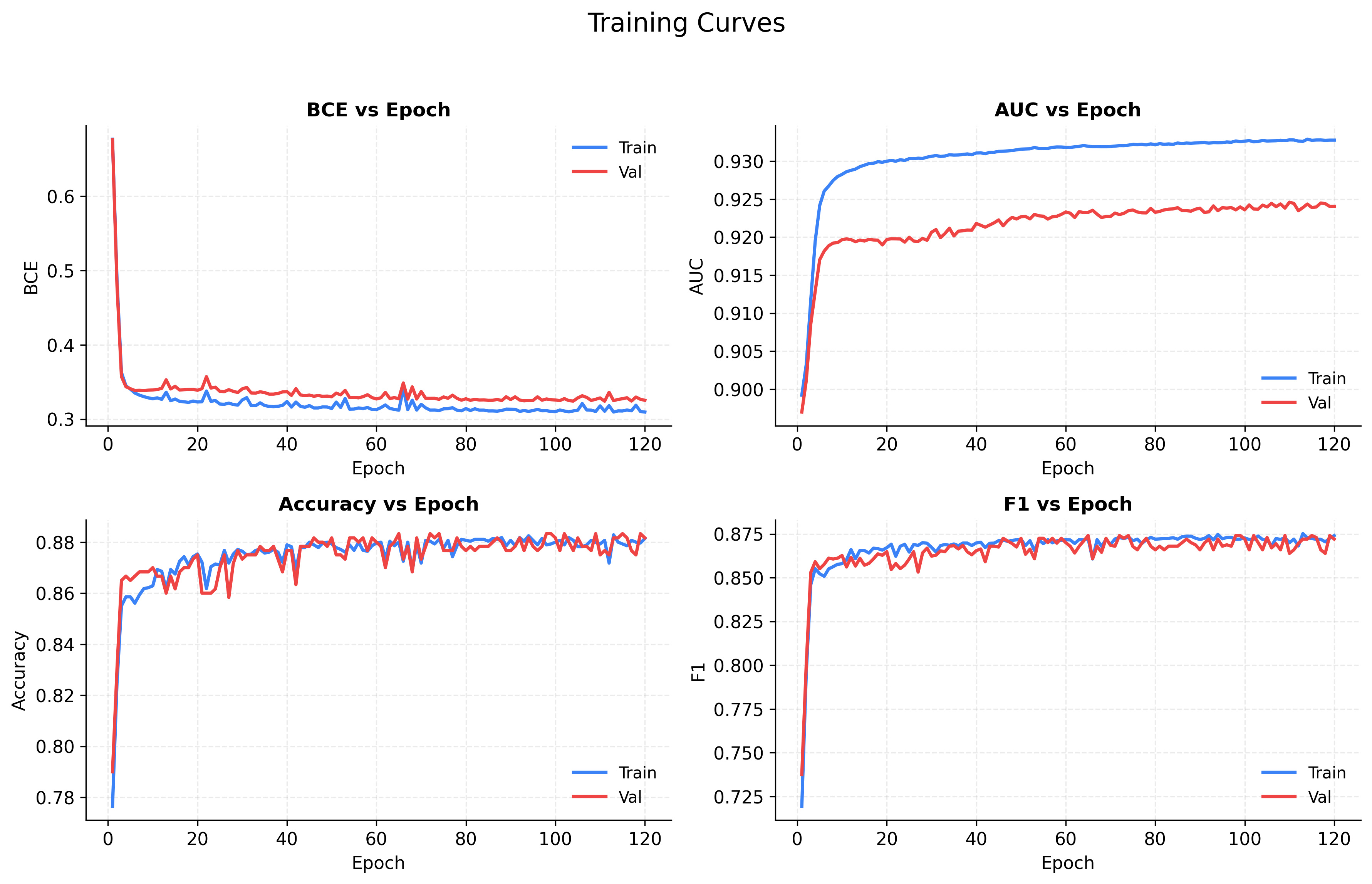
- Loss (BCE) - Both training and validation loss drop rapidly in the first ~10 epochs and then gradually flatten, showing stable convergence. The curves stay close, indicating no major overfitting.
- AUC vs. Epoch - Small gap ~0.01 between Train AUC and Validation AUC - which indicates model ranking positive vs. negative pairs very well.
- Accuracy - Climbs from ~0.78 to ~0.88, plateauing after ~40 epochs. The parallel curves suggest that what the model learns on training data generalizes well.
- F1 Score - Tracks closely with accuracy, indicating a balanced trade-off between precision and recall - the model isn’t overly favoring one class.
Step 5 - Evaluating Performance
Figure 2 - Performance Story
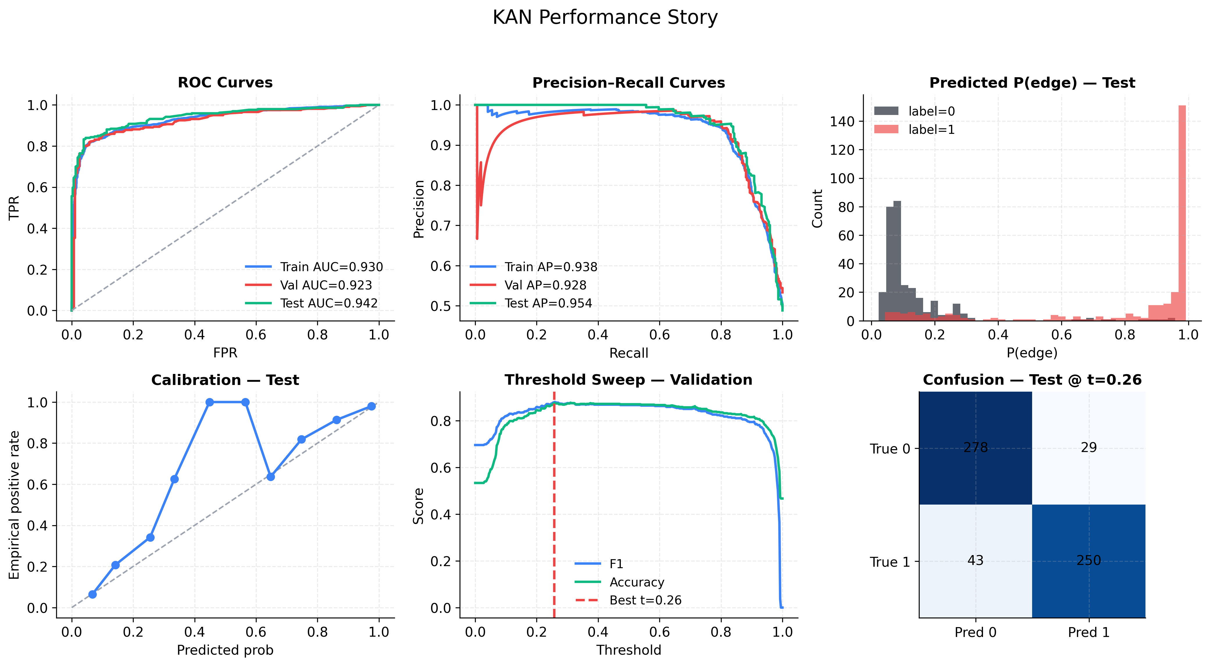
- ROC Curve (top-left) - With AUC ≈ 0.92-0.94 across splits, the model distinguishes linked vs. non-linked pairs with high reliability.
- Precision-Recall Curve (top-middle) - High average precision (0.93-0.95). At most recall levels, the model keeps precision high. There’s only a dip in precision when recall is extremely high (trying to catch every positive).
- Probability Histogram (top-right) - Red (true links) cluster near 1.0, black (no links) near 0.0, with only a small overlap - the source of the ~0.88 accuracy ceiling.
- Calibration Curve (bottom-left) - At predicted probabilities ~0.4–0.6, the actual positive rate spikes higher than expected. Raw probability scores are overconfident in the middle range.
- Threshold Sweep (bottom-middle) - Best F1 at threshold = 0.26, not 0.5. This shift catches more true positives without flooding with false positives.
- Confusion Matrix (bottom-right) - Balanced errors (29 FP, 43 FN) against 528 correct predictions. Slightly more missed links than false alarms, but both low.
Step 6 - Understanding What the KAN Learned
Figure 3 - How KAN Learned
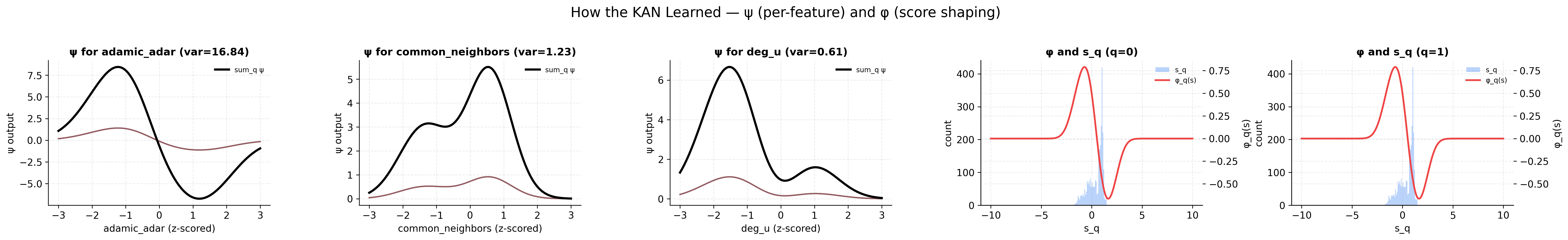
- Adamic-Adar (var = 16.84) - Most influential feature. Displays a peak-dip-rise: highest positive influence at slightly below-average values, a penalty just above average, and recovery at very high values - a complex non-linear pattern the model exploits heavily.
- Common Neighbors (var = 1.23) - Second-most important. The largest boost appears at above-average counts, with a smaller bump for slightly below-average values.
- Degree of u (var = 0.61) - Minimal influence. Small peaks at low and high extremes, suggesting degree alone is weakly predictive.
- Shaping Function φ (right) - Maps combined score
s_qto link probability. Steep slope near 0 means predictions are highly sensitive in this range - explaining why a 0.26 threshold works better than 0.5. The blue histogram shows most samples lie just above 0, in the “tipping point” zone.
Step 7 - Quick Takeaways
- Feature engineering - Adamic-Adar and Common Neighbors are the main drivers; Degree is barely used.
- Non-linear learning - KAN found “sweet spots” where features are most predictive, not just monotonic trends.
- Interpretability - ψ and φ plots make the model’s reasoning transparent.
Next Step
In a future post, I *might* (no promises) train a standard MLP on the same dataset and compare:
- Performance metrics
- How each model uses the same features
Code and Data
Dataset citation:
@inproceedings{nr,
    title={The Network Data Repository with Interactive Graph Analytics and Visualization},
    author={Ryan A. Rossi and Nesreen K. Ahmed},
    booktitle={AAAI},
    url={https://networkrepository.com},
    year={2015}
}
Code repository: GitHub - SSareen/food-network-analysis-kan
Update: I’ve now trained a standard MLP on the same dataset and published a short comparison here: MLP vs KAN on Facebook Food Pages.